

Nagisa Ichikawa | Lightroom Presets "WISP" "MATTER"
Nagisa Ichikawa | Lightroom Presets "WISP" "MATTER"
Lightroomプリセット
Couldn't load pickup availability
購入時の注意事項と購入後の設定。必ずご確認下さい。
購入時の注意事項と購入後の設定。必ずご確認下さい。
Nagisa Ichikawa Lightroom Presets (2 types)
"WISP" and "MATTER"
Nagisa Ichikawa, a photographer and creative director who focuses on the traces of people and time etched into everyday life and travel, has created these Lightroom presets. "WISP" was created with the intention of preserving the light seen in person in the photograph. It softly adjusts images while utilizing the sense of light and atmosphere. "MATTER" creates a moderate "heaviness" in photos by balancing colors and tones, bringing out the presence of objects and the depth of space. These two presets are designed to enhance the presence of light and the three-dimensionality of objects.
*Each preset includes two file types: "dng" and "xmp."
|
"When I finish a photo, more than 'how to change the colors,' I prioritize how to preserve the light, atmosphere, and presence of objects that I saw in that photo. The presets 'WISP' and 'MATTER,' which I created for GENIC this time, are two presets organized into different directions, incorporating points I particularly like from the development settings I've been using frequently lately. Both aim to subtly soften the harshness of digital RAW while adjusting the relationships between the original light, colors, and tones. 'WISP' is about how light lingers in space. 'MATTER' is about how objects exist in space. Keeping these differences in mind, I finished them so that they can bring out the three-dimensionality of a photo from different angles. Rather than being finished just by applying the preset, I hope you'll use them as a base for making subtle adjustments to get closer to what you saw and felt in the moment." —Nagisa Ichikawa |
Preset ① "WISP"
"WISP is a preset that softly adjusts the light of a scene while preserving the sense of light and atmosphere. Rather than simply brightening a photo or making dark areas appear white, it's designed to subtly suppress highlights and white levels while retaining light within the midtones. The goal was to achieve a finish where even the dark areas have a subtle atmospheric quality.
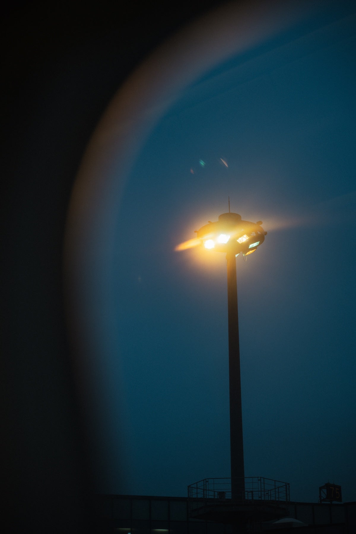
In backlighting or evening scenes, it allows light to spread softly through the space. In quiet natural light or photos with fewer colors, it adjusts so that the tonality of light and shadow itself remains as an impression. If the original image is underexposed, slightly increasing the exposure will make the light preserved in the midtones more visible.
Regarding color, rather than strongly leaning towards warm or cool tones, I focused on preserving the temperature of the light appropriate for that place and time. For white balance, it's recommended to first set it to where the light in the scene looks natural, and then fine-tune it to your preference.
Also, if the black level or shadows are lowered too much, or the white level is increased too much, the atmospheric quality of WISP's midtones may be weakened. Even when tightening blacks or strengthening highlights, making gradual adjustments helps retain its characteristic touch.
Please try using it when you want to preserve the kind of light that was present in the photo, such as in backlighting, morning and evening light, or scenes you saw by the sea or while traveling."
—Nagisa Ichikawa
Preset ② "MATTER"
"MATTER is a preset that enhances the presence of objects and the depth of space by adding density to colors and tones.
While giving colors a strong presence, instead of increasing saturation to make them vivid, it creates 'heaviness' through the brightness and depth of each color and the tonal differences in the midtones. What's interesting is that photos with color gain density, while photos with fewer colors maintain a neutral impression. Since it's not designed to apply strong colors to shadows or highlights, for concrete, metal, black, or white products, the presence and volume of the material itself come forward more than the color.
In particular, greens and yellows are designed to sink a little deeper, making it easier for contours and depth to emerge in plants and grasslands, while reds and oranges don't sink too much and maintain a strong presence in the frame.
Therefore, in photos with a large area of plants or greenery, it may feel a little dark immediately after applying. This is due to the luminance difference of each color that creates MATTER's three-dimensionality, so first try adjusting the exposure while looking at the overall photo. Even if the exposure is slightly increased, the sense of distance between colors and their density tend to remain relatively well.
If the original image is already underexposed, slightly adjusting the shadows and black level to prevent dark areas from becoming too heavy will make it easier to maintain its characteristics while tidying it up. Rather than significantly increasing saturation, adjusting the exposure and tones first will likely help maintain a MATTER-like finish.
It is recommended for urban snapshots, architecture, plants, food, products, etc., when you want to firmly preserve the feeling of colors and materials existing there, and the sense of distance within the frame."
—Nagisa Ichikawa
About the Author
 Nagisa Ichikawa
Photographer / Creative Director. She studied fashion design and has experience in PR/communication for international luxury brands. Currently, she is involved in creating brand and project worldviews using photography, video, and words, moving between sensibility and logic. In her photography, she focuses on the traces and passage of time etched into people, objects, and landscapes encountered in daily life and travel, exploring expressions open to each viewer's interpretation and imagination.
Read Nagisa Ichikawa's articles on GENIC WEB